The iOS 14 update for Apple devices has its users creating customized home screens similar to the jail-broken iPhones popularized in the earlier half of the decade. The update features the long-awaited customization widget options for your home screen, allowing iPhone users to personalize their phones to their aesthetic.
Check out these unique, themed layouts created by ASU students to inspire your own wallpaper aesthetic.
Star Wars: A New Home (Screen)
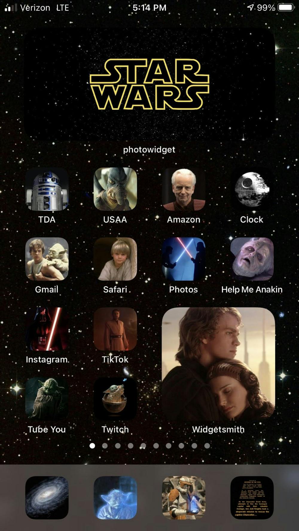
Thomas Abel, a senior finance major at ASU, themed his freshly updated layout on his favorite movies from the Star Wars series.
“I’ve been on a Star Wars kick lately,” he said. “I went to Disneyland this January and went to their Star Wars land, so it was the first theme I thought of.”
He said he based his image selection on the apps the widget would represent. The bottom row shows a map of the galaxy for Google Maps, the ghost of Yoda for the Snapchat ghost logo, Commander Cody using a communicator for the phone app and the classic text scrolling at the start of the movie for the text messaging app.
“The death star looks like the clock app’s logo so I chose that, and Palpatine is really rich and powerful so I chose him for Amazon,” Abel said.
Pocket Gallery
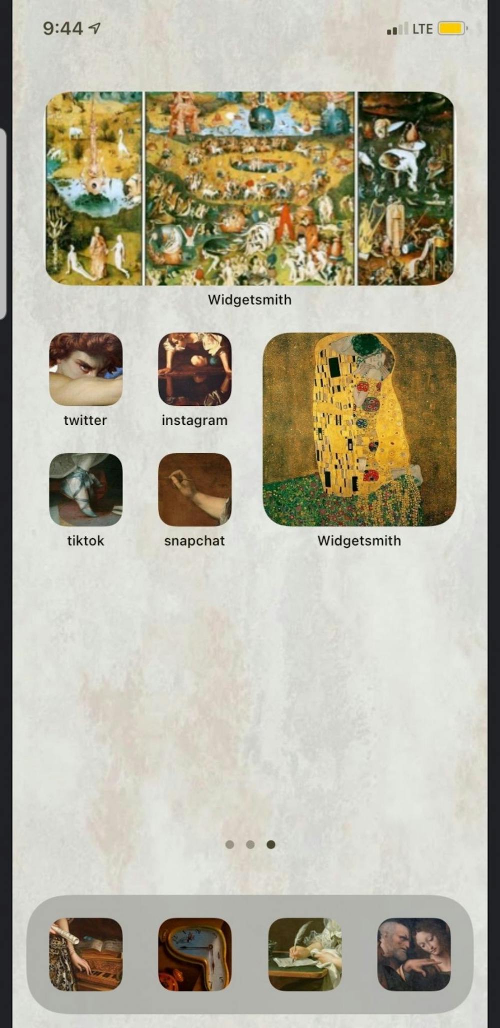
Jessica Schaffer, a senior studying art history, themed her layout to mimic art student heaven.
“I really wanted to create a little gallery in my pocket,” she said.
Schaffer is in her senior year as an art history major, so she based the first page on her schoolwork. She included a large widget with Marcel Duchamp’s 1917 Fountain to inspire her since she had a major upcoming project focused on that particular work.
“For the social media apps, I wanted to be a little funnier ... or at least my art historical sense of humor,” she said. “I have Caravaggio's 'Narcissus' for Instagram and Artemisia Gentileschi's 'Self-Portrait as the Allegory of Painting' for Snapchat.”
She also included Giuseppe Arcimboldo's “Autumn” for her calendar, and she said she will be switching through his seasonal series throughout the year.
"Over the Garden Wall"
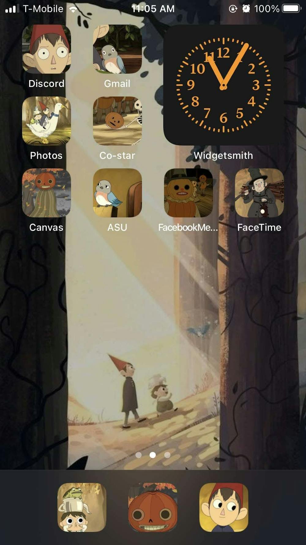
In true Halloween spirit, sophomore art education major Molly Butcher went for an "Over the Garden Wall" themed layout inspired by the dark fantasy animation.
She said she included orange and black colored widgets for her calendar and clock and featured the characters from the show in each of her new app icons.
“I was done with summer, so I said ‘Whatever, it’s fall now,'" Butcher said. “The show is so amazing, and since it’s set in autumn, I thought it would be a cute idea!”
"Euphoria"
Kiley Tudor, a sophomore elementary education major, went for a more classic revamp of her iPhone aesthetic.
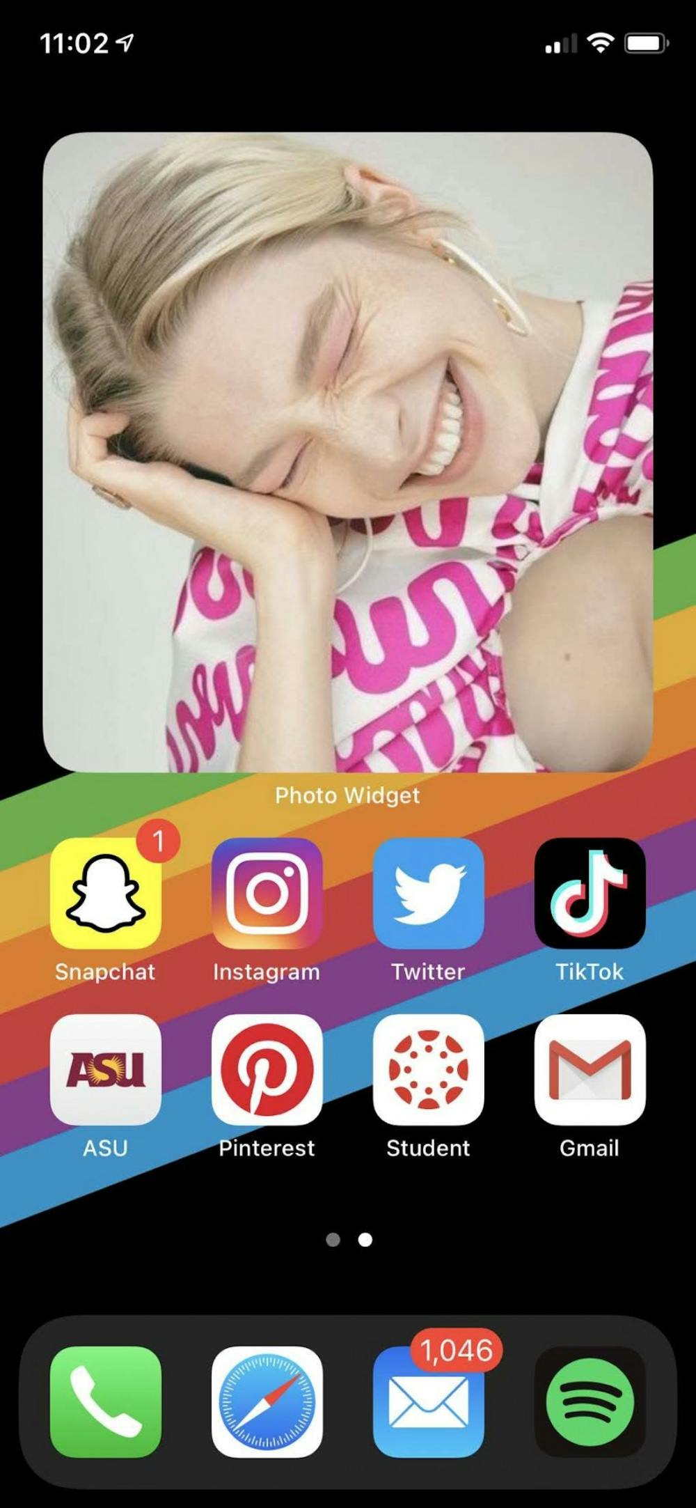
She went for a rainbow wallpaper to match with her slideshow widget, which featured photos of the "Euphoria" cast.
“The show is made super well with beautiful visuals, and the story is just so relevant and relatable to today’s teenagers," Tudor said. "There’s just no other show I’ve seen that’s so honest and raw."
Stream Screen
Taking inspiration from his favorite TV shows, freshman computer systems engineering major Rohaan Kamaraj featured his favorite characters from three of his favorite shows in his layout.
The larger widgets included Barney and Robin from "How I Met Your Mother," Dio from "JoJo's Bizarre Adventure," and Mikasa and the Attack Titan from "Attack on Titan."
“I like the update because it made my homepages way more aesthetic,” he said.
Pastel Dreams
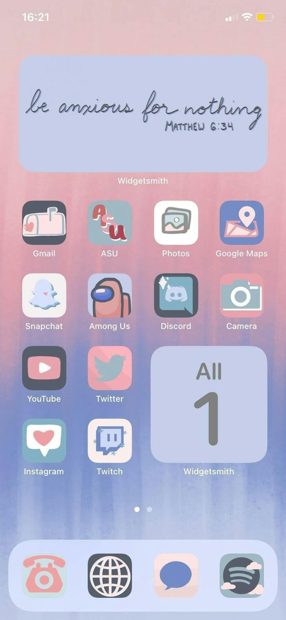
Kazhra Kelcho, a junior studying speech and hearing science, took inspiration from her personal aesthetic for her pastel-themed layout.
She said she included a quote from the Bible on a large widget to remind her to stay calm during this chaotic time.
“I have a set color palette that I use when decorating my room or when buying school supplies,” Kelcho said. “I like when everything matches.”
And one for us Android users
For those of us who remember customizing our old Samsung Gravity phones in 2008 with widgets, the celebration surrounding Apple’s tardy customization update was confusing. Nonetheless, the aesthetically pleasing layouts all over Twitter inspired me to find out how us Android users can recreate the new iPhone look with our customization features.
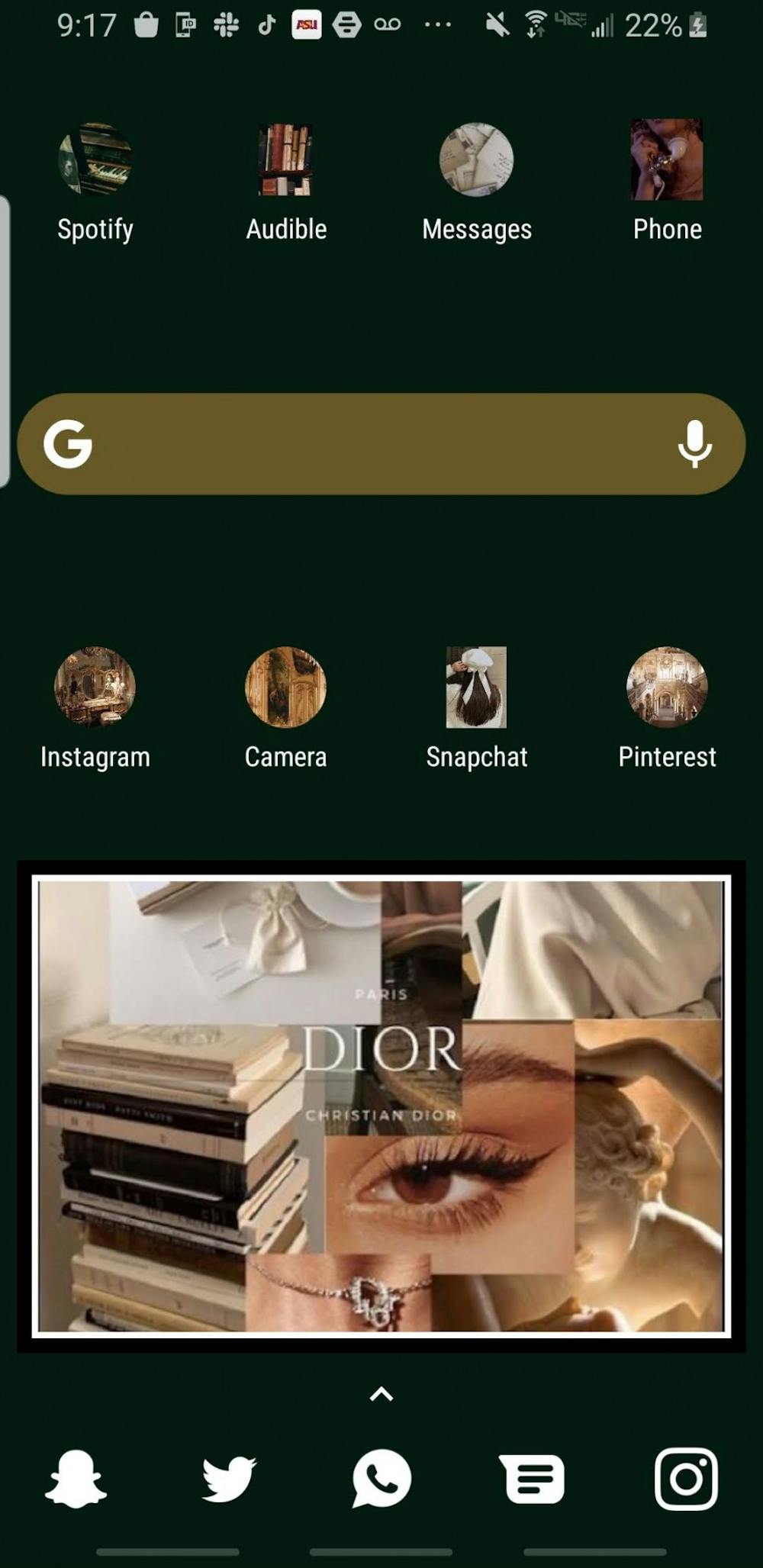
I went for a dark green and gold aesthetic in celebration of the cold autumn and winter weather that I hope will arrive in Arizona soon. I already had white icons on my Samsung, so I went for a Parisian-inspired collage for the bigger widget at the bottom. I’m obsessed with Pinterest, so a lot of the images I chose were from my Pinterest feed. It took me about 15 minutes, and I definitely recommend it to my fellow Android users.
Reach the reporter at vaishalini@asu.edu and follow @thevaishalini on Twitter.
Like The State Press on Facebook and follow @statepress on Twitter.
