Yesterday I visited the Japanese Friendship Garden in Phoenix for some artistic inspiration that I would then pass on to you lovely readers. But as you know, you can’t force good art, so the pieces I ended up with weren’t my best work. I’ll still share them with you of course, but my writing will go more towards explaining my creative process rather than analyzing my pieces.
 Artistry tools: pencils and more pencils
 My sketchbook since 2009.
In case you haven’t been to or heard of the Japanese Friendship Garden, it’s a great little oasis in the middle of downtown Phoenix at 3rd Ave. and Roosevelt. The garden is lush with trees, grass, shrubbery and flowers, and has a rather large pond full of koi fish. These fish, however, are anything but coy (heh, I see what I did there). When buying your ticket, you have the option to spend an extra dollar on bread you can use to feed the fish. The thing is, you don’t need bread to get these fish to flock to you when you glance over the side of the bridge; they come whether you have food or not. All in all, the garden is definitely worth a visit at only $5 admission.
OK, on to the art. So I figured I would try to get about three different pieces done during my time at the garden: an abstract, a still life and a landscape. Unfortunately, I only got to the first two, since my abstract took far longer than expected.
I started by walking around the entire garden until I came to a bench facing the waterfall. I sat here for the rest of my visit because it was such a serene spot, with a tree shading me and the sound of the waterfall creating some great ambient sound.
 Said waterfall that inspired drawing.
My first piece was “inspired” by the waterfall hitting the pond. I say “inspired” because I never actually feel as if something is inspiring me to sketch. Instead I will see something, think, “eh that’s kinda cool,” and attempt to draw it, but end up getting distracted and taking it in a different direction entirely. This sketch at least ended up looking a bit like it was still inspired by the waterfall. However, I was completely happy with it — but then I made the mistake of trying to add color.
 Waterfall-inspired sketch. Never add color.
My opinion is, always has been, and always will be: don’t add color. I almost exclusively create art in black and white because I struggle with color. Every time I’ve tried adding it, the piece ends up looking worse than it did when I started. I just don’t know what to do with it: where to put it, what part should be what color, etc. I just don’t get it, someone teach me please.
My next piece was a still life of the tree branch hanging by my head. I love branches because of their shapes, and drawing them permits some creativity on the shading front.
The branch turned out great shape-wise, but then I made the same mistake and I added color. Why? Why do I do this to myself?
 Tree still life.
The subpar art of today has nothing to do with my environment. The gardens are amazing. The creative block had everything to do with myself. I’ve been stuck in a bit of a rut lately and I haven’t been creating as much as I used to, so I’m hoping that one of these days when I’m forcing myself to sketch, the barrier will lift and I’ll have more thoughts than I’ll know what to do with. So . . . fingers crossed the right side of my brain doesn’t explode.
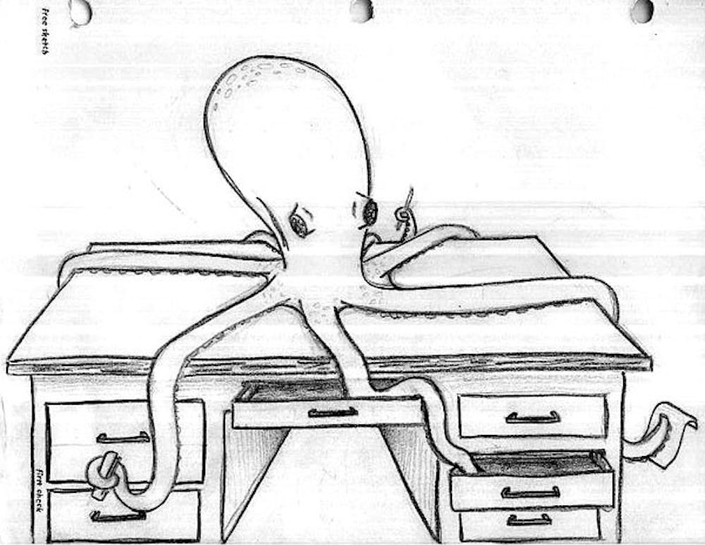
Bonus: Because I feel like I let you guys down today by not putting forth my best work, I’ll include a fun little bonus sketch I did in art class in high school. It continues to be one of my favorites, though I’m not sure why.
 Bonus! Octopi actually make for very cooperative models.
If you’d like to reach me with comments, concerns or suggestions you can email me at anconrad13@gmail.com or tweet me @alliectersely


